FinBuddy A Personal Finance App Designed to Boost Daily Engagement
Creating a simple, intuitive budgeting experience that helps users stay in control of their money with confidence.
UI/UX DesignUser ResearchPrototypingFigma
Prototype
Figma
Duration
1 month
Role
Lead UI/UX
Overview
I identified a key opportunity: many users struggle to stay consistent with budgeting apps due to complexity and lack of guidance. They needed a user-centered finance app that feels supportive, easy to use, and engaging over time.
Our mission: design the app from scratch to Improve usability, Increase daily engagement, Build long-term financial confidence for users
The Challenge
Through initial user research, we identified several key pain points:
1
Low Financial Confidence
Users often feel anxious or unsure when managing money. Many don’t know where to start or how to make sense of their spending habits.
2
Lack of Guidance & Motivation
Most budgeting apps tell users the numbers but don’t coach them or encourage consistent engagement, leading to drop-off after a few days.
3
Complex Financial Tools
Existing finance apps can feel too technical for beginners. Users want powerful features, but in a way that feels simple and friendly.
4
Difficulty Building Habits
Sticking to budgeting requires routine, but most apps don’t make the experience rewarding or personalized making it hard to stay committed.
Without a clear and supportive experience, most users abandon budgeting apps early—industry data shows that over 60% of users stop using finance apps after the first week.
Our Approach
To design a product that truly supports users, we followed a user-centered design process from the very beginning.
User Research
We interviewed potential users from different financial backgrounds (students, young professionals, freelancers, and families) to understand how they currently manage money and where existing apps fail them.
Key Insight #1
"I just want to quickly check my balance and recent transactions when I open the app—not be bombarded with offers."
Key Insight #2
"Most budgeting tools are confusing. If it feels complicated, I give up."
Colors & Typography
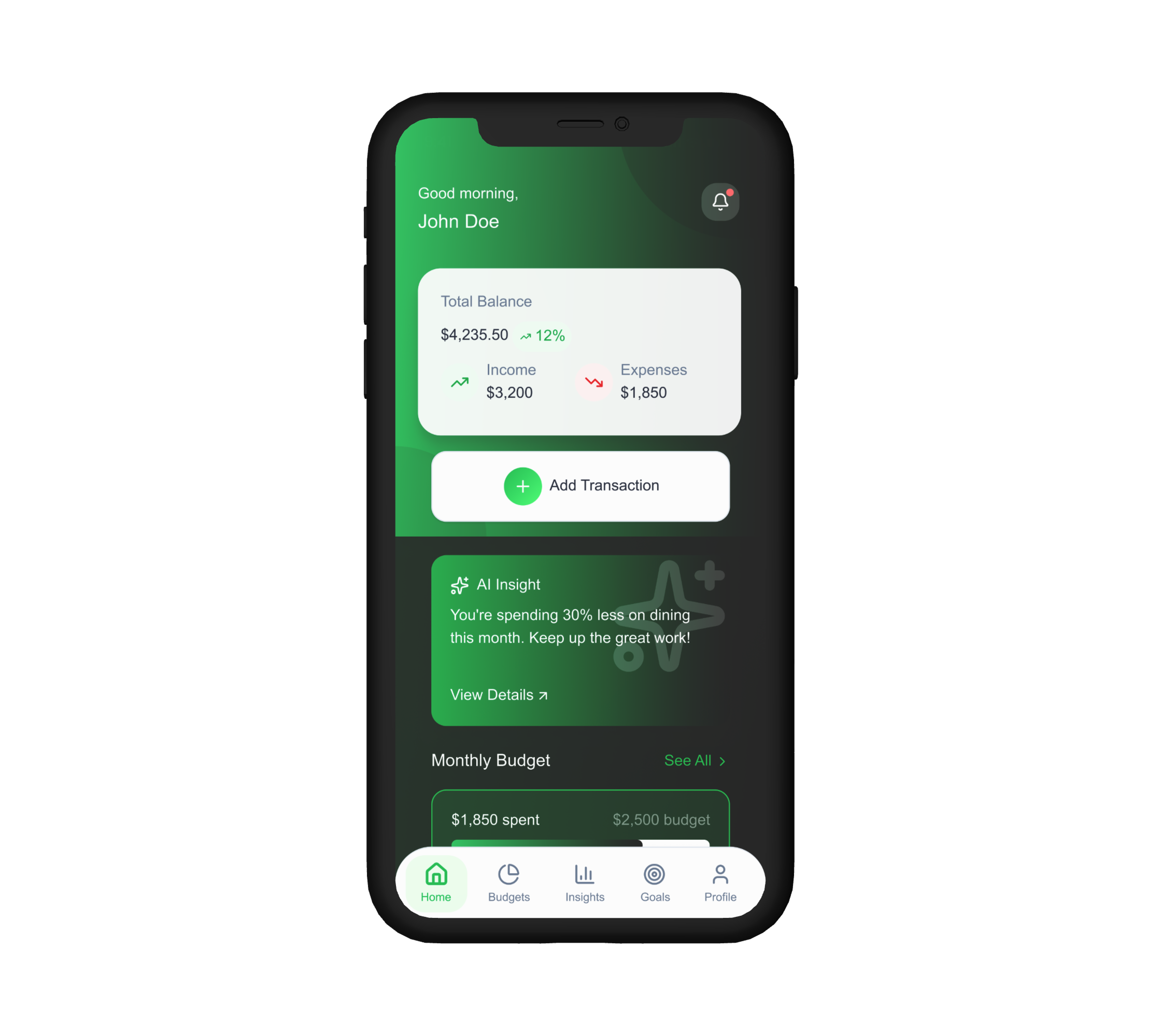
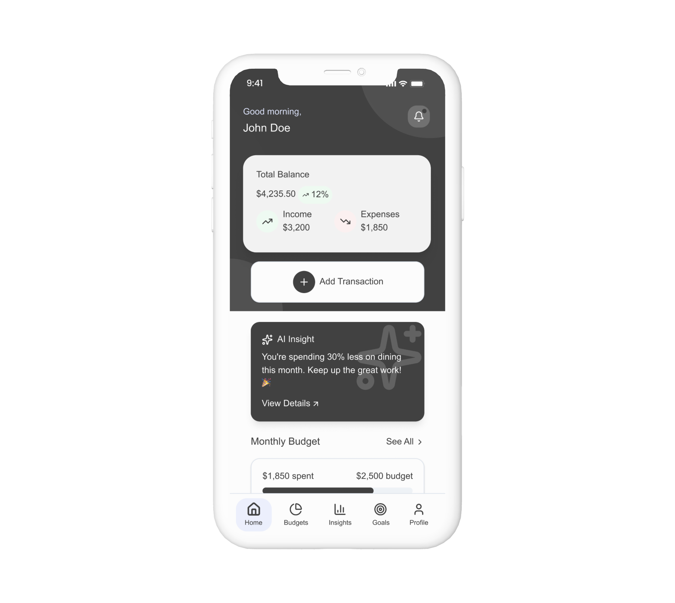
To reduce anxiety around money, FinBuddy's interface is built on a calming palette and clear typography. A teal green highlights key actions, while soft neutrals ensure legibility. Unifying these elements is a textured background of linear green fading to black, a subtle yet persistent reminder of progress and financial success.
Information Architecture
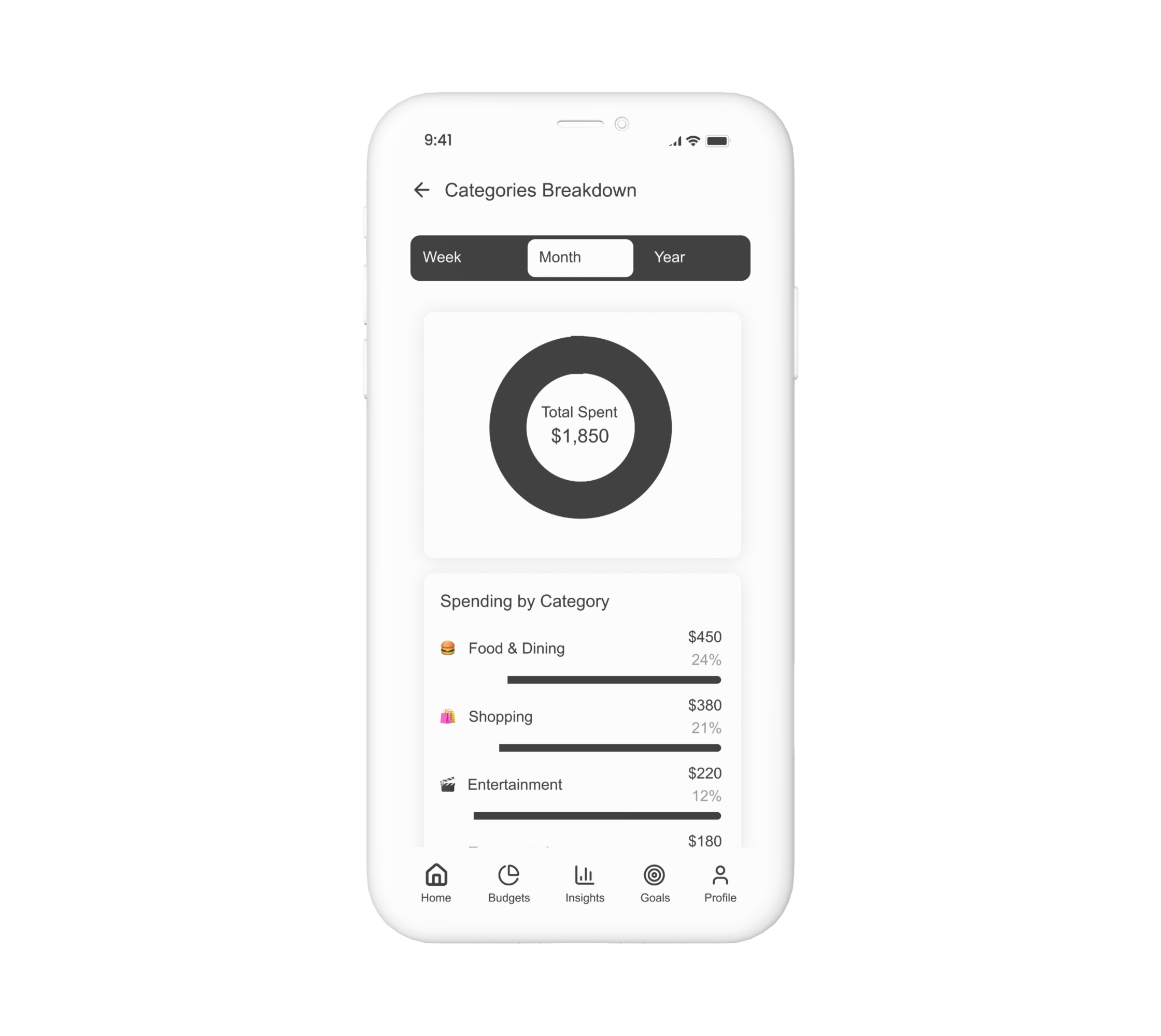
To ensure the app feels intuitive from the first tap, we structured the app around real user priorities, focusing on the most common tasks: checking balances, viewing transactions, and managing budgets.
Wireframing & Prototyping
We started with low-fidelity wireframes to explore different ways of organizing features and simplifying user flows.
Through multiple iterations and quick user feedback sessions, the designs evolved into an interactive prototype focused on clarity, motivation, and ease of use.
Through iterative testing and user feedback, we refined the prototype to ensure the app felt intuitive, engaging, and aligned with users’ real financial needs.
User Testing
We conducted usability testing sessions with 10 participants from our target audience to evaluate the app’s clarity, navigation, and overall experience.
Key Insights
Users found the onboarding process clear and motivating.
Budget setup was quick and easy to understand.
Participants appreciated the friendly tone and visual simplicity.
Suggestions included adding goal reminders and progress tracking.
These insights helped us refine the prototype, improve interaction flow, and enhance the overall user experience before moving into high-fidelity design.
The Solution
To address users’ financial challenges, we designed FinBuddy a modern, supportive finance app focused on simplicity, guidance, and long-term engagement.
Every design decision aimed to make financial management feel approachable, not intimidating.
Before
Users felt overwhelmed by complex financial tools
Existing apps lacked emotional connection or support
Information was presented without clear prioritization
Visuals and tone felt cold and impersonal
After
Friendly and intuitive interface with simplified flows
Personalized insights based on goals and spending habits
Motivational language and progress tracking
Clean, human-centered design that inspires trust
Key Design Decisions
Personalized Dashboard
Designed a clear and adaptive dashboard that focuses on each user’s financial goals, providing quick insights and gentle motivation.
Guided Navigation
Structured navigation around five essential actions, Track, Plan, Save, Learn, and Grow for a more focused user journey.
Smart Reminders
Introduced helpful, non-intrusive reminders that encourage users to check progress and stay consistent with their goals.
Visual Design System
Developed a cohesive visual system using soft contrasts, whitespace, and clear typography. The design communicates reliability, professionalism, and approachability, while guiding users toward key actions.
Although FinBuddy was developed as a conceptual project, user testing and feedback sessions revealed strong potential for real-world impact. Test participants appreciated the app’s simplicity, clarity, and supportive tone when managing their finances.


.png)